
Notice
Recent Posts
Recent Comments
Link
| 일 | 월 | 화 | 수 | 목 | 금 | 토 |
|---|---|---|---|---|---|---|
| 1 | 2 | 3 | 4 | |||
| 5 | 6 | 7 | 8 | 9 | 10 | 11 |
| 12 | 13 | 14 | 15 | 16 | 17 | 18 |
| 19 | 20 | 21 | 22 | 23 | 24 | 25 |
| 26 | 27 | 28 | 29 | 30 | 31 |
Tags
- invalid data
- setInterval 외부 정지
- setInterval 중지
- 데이터테이블 데이터 넣기
- listener 1883
- 공인IP
- timepicker
- setInterval 정지
- Replication
- map이 undefined가 뜰 때
- transfer
- mySQL_Replication
- pm2 설치
- setInterval clear
- 1883
- pm2 상태 확인
- datagridview 직접입력
- AntDesign
- html #select #option #multiple
- 서버동기화
- DataGridView 직접 입력
- allow_anonymouse
- pm2
- 맥 어드레스
- c# datagridview 데이터 넣기
- mosquitto
- mosquitto.conf
- DatePicker
- pm2 시작
- pm2 확인
Archives
- Today
- Total
개발 노트
React - Ant design Charts 본문
import React, { useState, useEffect } from "react";
import ReactDOM from "react-dom";
import { Line } from "@ant-design/plots";

const DemoLine = () => {
  const [data, setData] = useState([]);

  useEffect(() => {
    asyncFetch();
  }, []);

  const asyncFetch = () => {
    fetch(
      "https://gw.alipayobjects.com/os/bmw-prod/1d565782-dde4-4bb6-8946-ea6a38ccf184.json"
    )
      .then((response) => response.json())
      .then((json) => setData(json))
      .catch((error) => {
        console.log("fetch data failed", error);
      });
  };
  const config = {
    data,
    padding: "auto",
    xField: "Date",
    yField: "scales",
    xAxis: {
      // type: 'timeCat',
      tickCount: 5
    }
  };

  return <Line {...config} />;
};

ReactDOM.render(<DemoLine />, document.getElementById("container"));
ant design에서 제공하는 차트 예제이다. 위와 같이 작성을하면 아래 사진처럼 나온다.
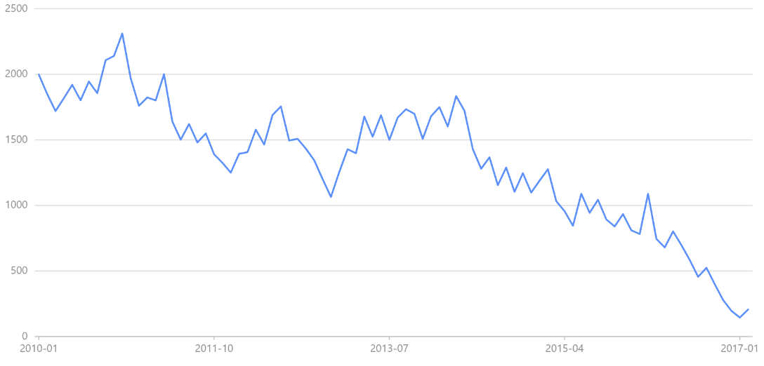
padding이나 xfield, yfield는 유명한 것이니 넘겨두고 tickCount는 숫자가 커질 수록 아래 yfield의 값들이 늘어난다.
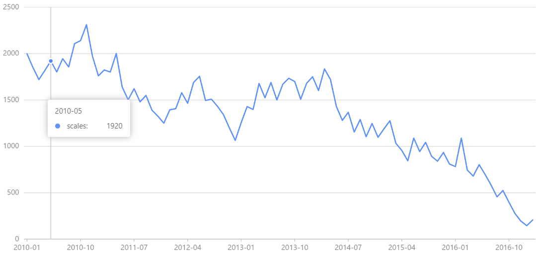
2010 ~ 2017까지의 기간들의 간격? 을 평균을 내서 10개만 보여주거나 5개만 보여주거나 하는 기능인 것 같다.
위의 사진들은 Line 차트중에 basic form이다.
아래 코드는 여러 선이 나오는 MultiLine chart인데 사진을 보면 다음과 같이 나온다.
import React, { useState, useEffect } from "react";
import ReactDOM from "react-dom";
import { Line } from "@ant-design/plots";

const DemoLine = () => {
  const [data, setData] = useState([]);

  useEffect(() => {
    asyncFetch();
  }, []);

  const asyncFetch = () => {
    fetch(
      "https://gw.alipayobjects.com/os/bmw-prod/c48dbbb1-fccf-4a46-b68f-a3ddb4908b68.json"
    )
      .then((response) => response.json())
      .then((json) => setData(json))
      .catch((error) => {
        console.log("fetch data failed", error);
      });
  };
  const config = {
    data,
    xField: "date",
    yField: "value",
    yAxis: {
      label: {
        // 数值格式化为千分位
        formatter: (v) =>
          `${v}`.replace(/\d{1,3}(?=(\d{3})+$)/g, (s) => `${s},`)
      }
    },
    seriesField: "type",
    color: ({ type }) => {
      return type === "register"
        ? "#F4664A"
        : type === "download"
        ? "#30BF78"
        : "#FAAD14";
    },
    lineStyle: ({ type }) => {
      if (type === "register") {
        return {
          lineDash: [4, 4],
          opacity: 1
        };
      }

      return {
        opacity: 0.5
      };
    }
  };

  return <Line {...config} />;
};

ReactDOM.render(<DemoLine />, document.getElementById("container"));
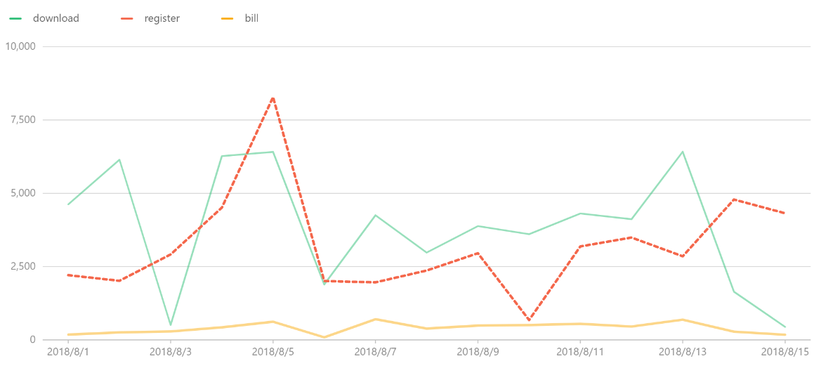
위의 코드에서 쓰는 data코드를 보면 type을 다르게 주고 위의 코드에서 type에 따라 나뉘는 것을 알 수 있다.
즉 seriesField에 값을 주면 그 값을 기준으로 선이 나눠지는 구조인 것 같다.
아래 링크에 가면 더 많은 차트들을 보고 사용할 수 있다.
https://charts.ant.design/en/examples/line/multiple#style-callback
'React' 카테고리의 다른 글
| React - 함수형 업데이트 (0) | 2023.01.03 |
|---|---|
| 개행, let vs State (0) | 2022.12.29 |
| React-antdesign table 컬럼 높이 값 바꾸는 방법 (0) | 2022.12.23 |
| React - ant-design 4버전과 5버전의 차이 (0) | 2022.12.23 |
| React - 글로벌하게 사용할 함수 만들 때 주의사항 (0) | 2022.12.22 |